-
-
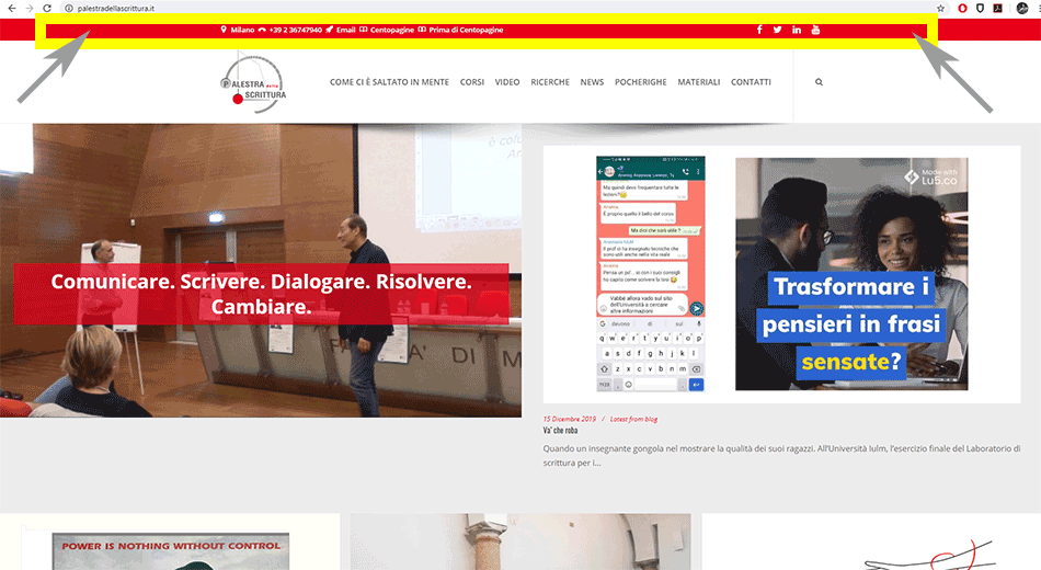
Hello. Please, I must also activate the top nav in navigation on mobile devices, that is, the red bar that opens the site on desktop: https://www.palestradellascrittura.it/ it must also be present in navigation for mobile devices, because it contains fundamental links (CENTOPAGINE and PRIMA DI CENTOPAGINE), reachable only from the top nav. When navigating from a smartphone, the red bar (TOP NAV) cannot be seen, instead it must be present. Would you be kind enough to show me the solution? Thank you very much. Best regards. Bruno

-
Hello,
By default, the top bar is not present in mobile. So to add it back you need to add some custom css. Try this code:
@media (max-width: 767px){
.top_nav {
    display: block !important;
    min-height: 110px !important;
}
.row-fluid .span6 {
    width: 100% !important;

}
.top_nav .widget {
    display: inline-flex !important;
    flex-wrap: wrap !important;
}
.top_nav .icon_text {
    display: flex !important;
}
.top_nav_transparency .widget:last-child {
    justify-content: center !important;
}
.top_nav .pull-right {
    float: left !imortant;
    margin: 33px 50px !important;
}
}
You can customize it further using custom css.
Let us know.
Best regards! -
Thanks a lot Mirela!!! There is only one problem: the last row, with social icons, on the desktop there are 4, on smartphones instead you only see the first 3 (the Instagram one is missing). I would like to see all 4 social icons and if possible have these aligned in the center. Thanks Mirela for your patience and support. Best regards. Bruno
-
Hello,
You are welcome Bruno!
I don’t see 4 icons in desktop either. See screenshot: https://ibb.co/MDCcFtd
In the code as well, there are listed only 3 socials. Can i see a screenshot of what you are seeing?To further center the icons in mobile, add this code inside the
@mediarule (my last code):#social_widget-6 ul.footer_social_icons.simple { padding-right: 25px !important; }Result: https://ibb.co/9g56Gb5
Let us know.
Best regards! -
Hello Mirela. I’m sorry, you’re absolutely right: there are 3 icons, sorry for the mistake. Your latest css is perfect: I used 20px :) Thanks a lot for your support. Best regards. Bruno
-
Dear Mirela, sorry if I still disturb you. The icons are now 4, I changed the css to 10px, but on vertical smartphones you cannot see them, you can see all 4 icons only on horizontal smartphones, but they are not centered. Could you show me the solution to see all 4 icons also on smartphones? Centrally aligned. Thanks again for your support :)
-
Hi,
Please try to change this:
@media (max-width: 767px){from 767 to 991
Let me know if it works
Thank You
-
Thanks a lot for the support. Best regards. Bruno
-
You’re welcome :)
If you like our theme and support, leave us a rating on Themeforest, it’s very important for us :)
https://themeforest.net/downloads
Thank You so much
-
You must be logged in to reply to this topic.