
If the term “responsive web design” is new to you, don’t feel bad, I promise you’re with the majority. In about 20 seconds you’ll know what it is and be able to look smart by talking about responsive design at dinner parties. Responsive web design is simply this–a website design that adjusts gracefully to fit on desktop, tablet, and smartphone browsers. Ever pull up a website on your smartphone and it was just a very tiny version of what you would see on your desktop, so you zoomed way in, and then moved the website around and enlarged and shrunk it as needed to read text and click on things? That was not a responsive website. Or if it was, it left out the key point of adjusting “gracefully.” A responsive website looks good no matter whether you’re looking at it on a phone, tablet, or desktop.
Why its so important have Responsive Websites
There are different causes that people need and request responsive websites:
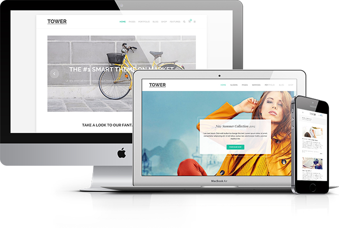
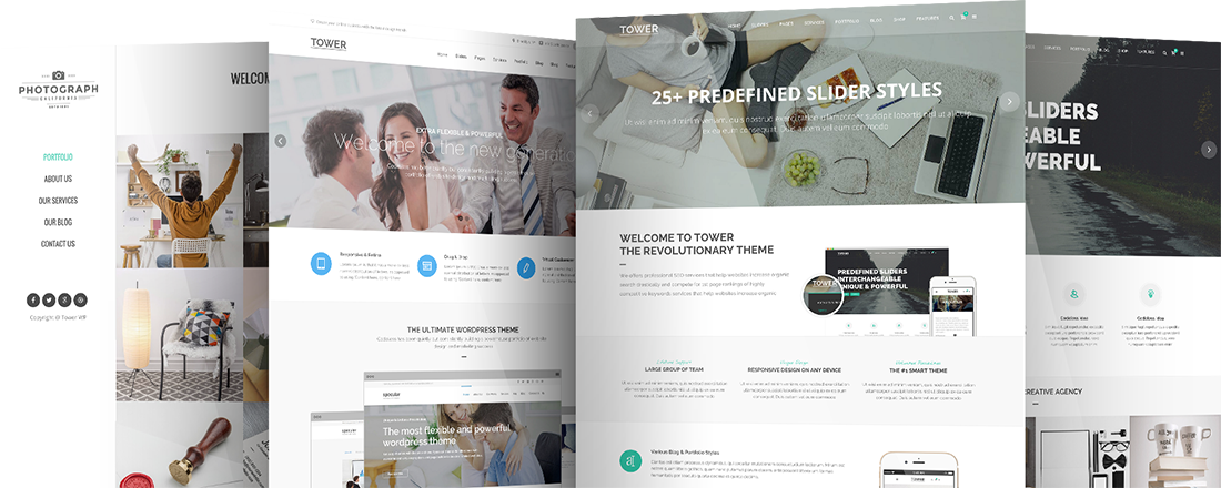
1. People use smartphones to access websites. So if you want to have an accessible website everywhere from mobile devices use Responsive WordPress Themes like Tower WordPress Theme business-driven so everything its designed perfectly and professionally like your business deserve.
2. Responsive websites can be reached from google and other search engines. Yes google new algorithm will rank first responsive websites. Responsive web design now its important for your seo campaign too. We recommend to use wordpress themes that are seo optimized and designed with responsive design in mind.
Take a look to our Tower WordPress Theme.