Building a website can get complicated. Building a website with WordPress can get clunky. Check this step-by-step Slider Revolution tutorial on how to use this popular slider on WordPress.
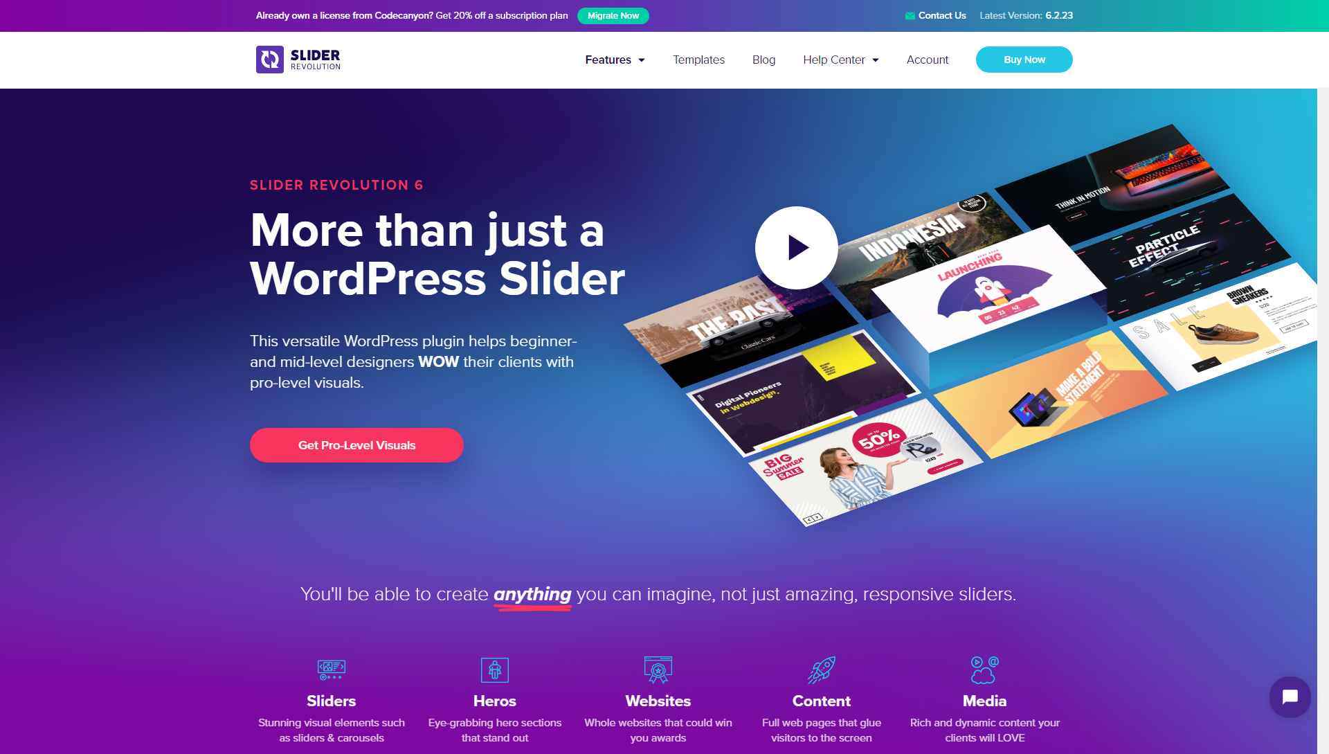
Anybody that needs enterprise quality sliders built into their WordPress site, or even somebody looking to build an entire website out of sliders just got lucky. Imbued with a complete suite of hyper-modular features to allow customization at any level of granularity and a library of over 200 proprietary themes, Slider Revolution 6 tutorial is here to help.
Slider Revolution is a WordPress plugin that has been rated number 1 by overall satisfaction, quality, and experience. Being a $29 solution has brought it over 350,000 independent websites and powerful industry partners such as Codeless.
The Slider Revolution has found demand for it to be so widespread that it could no longer be contained in just one space! Introducing Slider-Templates.com by Codeless. Need just one layout and no more? No problem. Slider-Templates.com is a free-to-join web portal that provides 100+ Slider Revolution Templates Suite.
Slider Revolution is a tool so powerful that using it can get overwhelming. Therefore to make the transition into a better website all the easier, a guide has been devised to take you through the smorgasbord of opportunity that now lays at the tips of your fingers.
Board the Vessel!
First and foremost, Start by acquiring Slider Revolution from CodeCanyon.
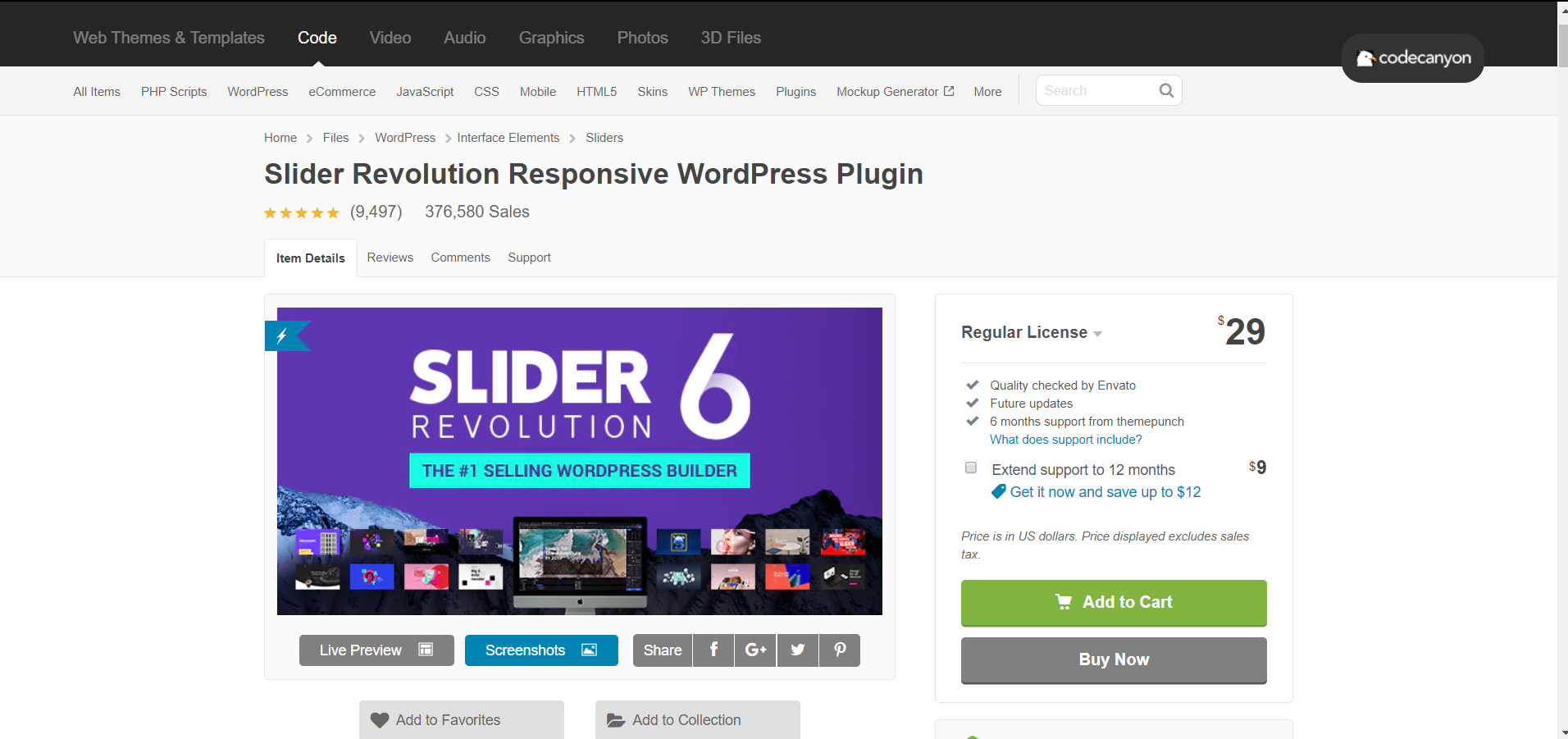
After you do, its files will become available for download; download those onto your device and head on over to your WordPress dashboard. Scroll your mouse over the “Plugins” → “Add New” and click.
Near the top of the screen, hit “Upload Plugin” → “Choose File” → “ insert your Codecanyon download” → “install now”. Once installed, just press activate and boom, we are ready to roll.
Prepare the Settings!
When driving a car, you always adjust your mirrors, seat, and steering wheel sensitivity, and just like a high-end car, Before launching into the building process with Slider Revolution, let us configure the most fundamentally important plugin settings so that it is smooth sailing all the way through.
How your site loads & renders across devices (mobile / tablet / notebook / desktop) can be your make it or break it;
In your WordPress dashboard, navigate to “Slider Revolution” → “Globals“
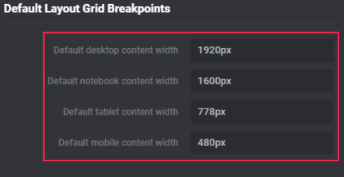
Here you will bump into a bunch of settings, don’t get confused and just look for the 4 rows titled: Default layout Grid Breakpoints and insert them according to the following image:
~ Quick brush up on device pixel dependencies ~
Standard Desktops are oriented at 1920-pixel width.
Notebooks, including Macs & horizontally oriented tablets, are confined within a 1600-pixel width.
Tablets, including Ipad, present optimal vertical imagery at 778-pixel width. However, some devices can stretch as far as 1025 in width when flipped on their sides; if you are looking to accommodate those users, then, by all means, adjust according to your preference.
Coming in the most diverse range of sizes & accounting for well over 51% of all internet activity are mobile phones. As a rule of thumb, try to stay below 500 and above 360 (480-pixel width)
Once you fill in those rows accordingly, please do not forget to click the lovely SAVE button at the bottom right.
Set Sail!
Ok, now that all the fundamentals have been taken care of, it's time to get your hands dirty and play around with your first Slide.
Move your mouse cursor back to the “Slider Revolution” Tab and hit the “New Blank Module” segment.

Start by making sure you are in the “Titles” tab and name your slide.
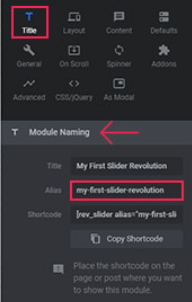
You will know that you are in the correct tab is you see a segment on the right of your screen called Module Naming. There the name of your slide should be entered into 2 rows: the Title row and the row directly under it, the Alias row.
Be aware that the Alias row should all be lowercased and separated with dashes; the Alias is what you will use later to add the Slide into your site.
Next in order is to make sure that you are using a slider type that you need. Click on the layout tab (to the right of the titles tab) and select one of the 3 slider layout variants.
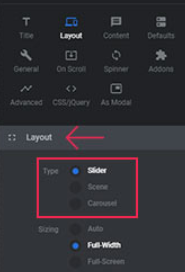
Variant 1 Slider – more that one slide. These come with bullets & arrows accompanying it.
Variant 2 Scene – only one slide. If you select this option the arrows and bullets will disappear.
Variant 3 Carousel – for the strong demand this will display multiple sliders at once through visual effects such as distance and depth maneuvering.
After you select the layout type suiting your needs, scroll on over to the sizing portion (directly under the layout types) and specify the sizing dimensions.
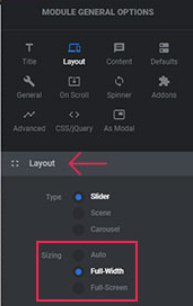
Variant 1 Auto – this option will adapt to its in page container. Typically this is used to animate a specific portion of a page.
Variant 2 Full-Width – this selection with fill the width of its page but adapt to the height of its segment. Good for a single horizontal portion.
Variant 3 Full-Screen – Covers the whole screen, regardless of the screen size.
***
Sliders can be used for absolutely any portion of a page; however be advised that the more sliders that appear on one page the slower it will load, in turn possibly putting your SEO ranking at risk of degrading.
***
Its time to guarantee visual compliance from this slide.
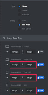
Directly below the sizing portion of the layout, click on the “Layer Area Sizing” and expand it.
All, but the very first desktop one, should be defaulted to OFF.
Activate them all and switch them to ON by clicking the module sliders. Doing so will automatically import the global visual render settings that you entered earlier.
The left pixel count denotes the width and the right denotes the height.
It is key to remember that there is no such thing as one universal sizing standard & it is worthwhile to be agile and experiment with the sizing.
Again, once you fill in those rows accordingly, please do not forget to click the very important SAVE button located at the bottom right of the screen.
**Extra Setting Skills:
On the right of the screen where all the tabs are located, make sure you are in the settings segment (if not click on the little gear icon).

This is the general options where most customization takes place.
Hit the “Defaults” tab.
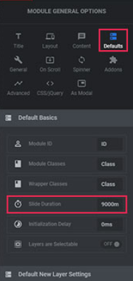
You will find a few settings to play around with here, but let’s focus on the most important one.
Slider Duration.
By default, it is set to 9000ms (milli-seconds) or simply 9 seconds.
We are all acutely aware that the internet audience has an attention span that does not like to wait long. To suit the audience that will be coming to your site you must understand how long they are willing to wait to see a slide change.
Of course, this is a parameter that depends on your industry and project purpose, but as a loose rule, it is better kept around the 3000-5000ms range (3-5 seconds).
Another nifty trick to know about is the spinner. Click the Spinner tab located one level below and one shift to the left.
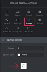
While your slides are loading you have the option of presenting a spinning loader.
This segment is exclusively one of brand image and personal preference.
You can keep it on if you’d like to, or;
You can turn it off.
Next, we have the “General” Tab.
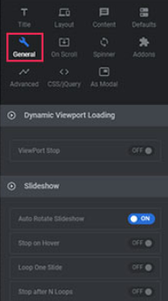
Clicking here, you find some very convenient features for your slides.
Exploring what is offered in this tab you will run into;
- Rotating preference
- Loop limits
- Mobile approval
- Kenburn adjustment (which directly improves loading times and page performance)
If you plan on having more than one slide in a project
Navigate your mouse back to the gear icon, move slightly left and click on the Quad-directional arrow pad.
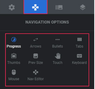
Here you will find options that deal with the transitions between slides.
Explore each one intimately to understand the peculiarities that are offered in each tab.
Port in the page!

Now that you have a slider built it is time to plug it into your page!
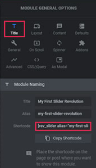
Navigate on back to the Setting (gear icon) and click the Titles tab.
In the Module Naming section right below the Title and Alias rows that you filled in earlier, you will see a row called “shortcode”;
Copy that shortcode
Head to your desired paged backend and plug it in.
Updating the page right after will give you a live preview right away!
To see the live previews and adjustments that you make while plugging this in, save your page changes!
Layer it ON!
It is time to construct a full slider project. Head back over to the Slider settings toolbar, shift one section over to the right of the quad-directional pad to the images icons & let's start building.

By default, the background is set to transparent.
Click on the drop-down menu and select what options suit your needs.
Selecting Image, you will be presented with the options to either upload media into the library or select some media from that already exists in it.
Once you choose an image it will appear in the workspace to the center/left.
***
Keep in mind that the image proportions should coincide with the pixelations we specified at the start.
***
Selecting External Image, you will have the ability to insert an image URL. Once you enter it press the “Refresh Source” button located directly below where you will enter the URL.
For optimal resolution when choosing the source size, it is best to be kept at “original”.
Diving deeper into the image settings segment; we are presented with 3 core options:
- BG fit (How the image will contour to its container)
- Repeat (Option to multiple the image over the pixel width)
- Position (Angling where you want the image to be present from)
Let’s roll on back to the background drop-down options.
If you are looking to keep it simple and just introduce a color, then simply select “Colored” in the types row.
Click the BG color row and a popup will appear.
Find the color, opacity, and tints that you are looking for and PRESS THE BLUE CHECK in the popup window; this will save your preference.
Do you like the Parallex effect? Perfect, it is readily available and granulated by 5% portions. (Make sure it is enabled in the Global settings module)
Perhaps you want to give your audience the ability to zoom in & zoom out of your slides as they please; fantastic, a Ken Burns effect Tab has been included to allow you just that.
Looking for more options to customize the background?
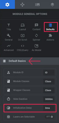
There are a few located under the “Settings Gear Icon” in the defaults Tab.
In the default Basics expanding module, directly below the slider duration setting that we addressed earlier, is a row called “Initialization Delay”.
Play around with the timeframe if you are looking to have your slide appear a little bit after your audience arrives at your page.
* Reminder:
The denomination is in (MS) milliseconds, so every 1,000ms is equivalent to 1 fill second.
Looking to animate the slide?
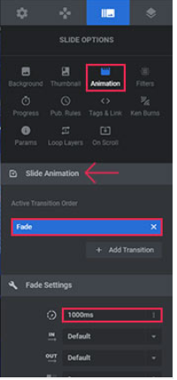
Slider Revolution has you covered.
Move on back over to the “Image” sections by the quad-directional tile and click on the animation Tab.
In the expanding menu potion titled Slide Animation, the active transition order will have a selection of effects to choose from;
After selecting your desired animation, move down the animation settings module and adjust the time parameters for them.
Time to add some layers to this.
Scroll on over to the Layers settings module located to the right of the image module as shown below:
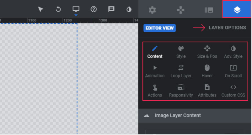
Opening the layer module you start the process off in the “Content” Tab.
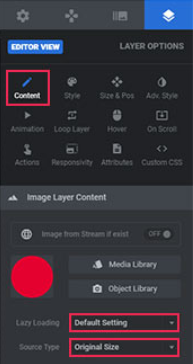
Within the “Content” Tab, will be the Image Layer Content Module where all your customization will take place.
Similar to the background segment that was covered earlier on you will need to upload or select an image from the media library;
Then adjust the Lazy loading & Source Type to match your image layer needs.
Let’s look at the Layer Styles Options
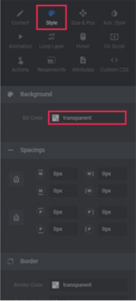
In this tab, you will have the opportunity to manipulate your image layers parameters including:
- Images Background color
Here you would be able to edit the image background color options to your liking.
- It’s spacing Properties
Here you would be able to edit the image space parameters such as how much room it takes up. The top 4 are more moving & Bottom 4 are for transforming.
- Border adjustment properties
Here you would be able to edit the image border parameters to add/remove a border if needed.
Next up are the Size and Pos (positioning).
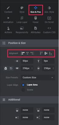
A simple module to get yourself accustomed to, the Size and Pos tab (one shift to the right of the previous style tab) would give you the ability to make surface-level adjustments that exist is a majority of other software products.
- Alignment
- Size Presents
- Layer Align
The additional module segment offers the all too familiar width and height properties that are influenced by the pixel parameters we specified at the start.
Layer Advanced options coming up:
This section will allow you to contort the image by qualities relating to rotations across all 3 general axes.
Additionally, we can play around box-shadow properties.
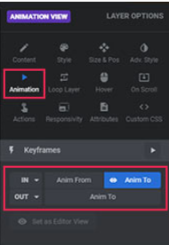
Following we have the animation options.
The IN/OUT keyframe dropdown options will give you full control over the entrance and departure properties of your slide.
Everything from fading to bouncing to gliding to folding, take a long look at the options and you will find one to your tastes.
Layer Hover Options (make it click!)
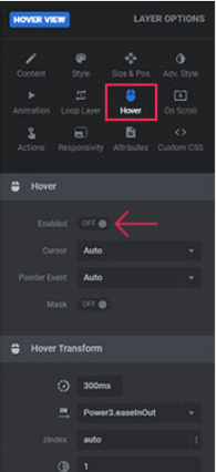
Like all good things on the internet, your slides will need to be clickable (or touchable for mobile).
Start by enabling the Hover option.
Work your way down the full range of options to make sure every parameter of this segment complements the rest of your work!
As a professional tip, in the Hover Transform module, the first row where the default should be 300ms; make sure that it never supersedes 600ms and does not fall below 200ms. That range is optimal for accidental hovers/scrolls or finger taps. Too low might over trigger it and to high might cause a disconnect from your audience’s desires.
Check yourself!

Before publicly launching all your beautiful efforts through slider it is strongly recommended that you check out how your slides test out on the battlefield!
Take a moment and explore your slide page across every avenue.
Desktop – are all renders according to their specifications?
Notebook – does the appearance transmit the same feeling as the desktop?
Tablet – how does the vertical orientation look? Does it work horizontally?
Mobile – check your phone, ask your friends to check their phones, are you happy? (trick question, is an artist ever truly happy with their piece?)
Each sizing and device option should be as optimally responsive as possible. Sometimes the images will get cut off due to the pixelation properties of each device; don’t worry, just realize where exactly in your slider stack this may be happening and just go back over that segment to make the proper adjustments.
***
A few thoughts to Keep in mind!
***
Whenever you are dealing with any portion of the slider segments that have to do with timing, please understand that the chronic nature of each layer might cause overlaps!
Manipulation of the Slider material stretches beyond images and colors. All the effects can be directed at the text, audio, and even video needs! If you are looking to port in a few videos from Vimeo or Youtube, just copy&paste in that specific video’s URL and voila.
Loops animations are a great help, however, an infinite loop will clutter your visual design space and continuously cache, causing a slowdown in loading times and resulting in a tarnished SEO position.
Explore & Grow with Confidence!
Now you have been prepared for war.
It is time to go and conquer digital hyperspace with your design principles and projects in hand.
The possibilities offered up by the Slider Revolution are constantly expanding to meet the growing demands of the public.
Always experiment.
Always challenge yourself.
Stop sliding into DM’s &
Start Sliding into the next Revolution.
Ludjon, who co-founded Codeless, possesses a deep passion for technology and the web. With over a decade of experience in constructing websites and developing widely-used WordPress themes, Ludjon has established himself as an accomplished expert in the field.




Comments