In the past few years, all areas of business have become customer-oriented. Sites have become more juicy and convenient, the same type of appearance and functionality has disappeared, they are filled with responsive design, which improves the user interface. To achieve this, many developers use Flexbox and Bootstrap.
Let's see what these concepts are, how they are applied, their advantages and disadvantages, and which one is better in 2023.
Flexbox
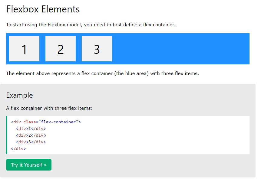
One of the concepts of CSS is Flexbox – Flexible Box Layout Module. Its layout provides the ability to place responsive elements automatically in a container based on the device's screen size. It retains flexibility in both content and sizing of elements, providing an efficient way to align and distribute container structures. Even if the size is unknown or constantly changing, the framework automatically adjusts and adjusts the distribution in space.
It makes it easy to enlarge an HTML page, because it allows you to fit many classes into each element. This increases the speed of the entire site.
Benefits:
● has many properties and capabilities for website development;
● blocks are easily structured, and elements are compressed and stretched;
● automatic alignment of structures vertically and horizontally;
● HTML elements lend themselves to formatting using CSS;
● automatic alignment of structures in columns and in a row;
● when setting RTL (right-to-left), all elements are independently displayed in reverse order.
Disadvantages:
● difficult for beginners to understand. In order to master the framework, you will need to learn its basics;
● not suitable for the layout of basic layouts.
Flexbox is a standard required for any front-end developer.
You can find a more detailed information about Flexbox in the article listed below: A Complete Guide to Flexbox
Bootstrap
The best UI library is Bootstrap, written in HTML, SASS, and JavaScript. It is filled with a huge amount of open-source code that can be used in the development of websites and mobile applications. There are many free and paid templates available.
To create a grid system, this framework uses floats. Its performance is low, except for the downloaded files. It is possible to create one or two classes. Version 4 uses the Flexbox model, which makes the system more powerful.
Benefits:
● built-in layouts from which you can start writing sites and applications;
● different layouts and elements can be easily combined together;
● each layout is equipped with instructions for use, with the help of which it is easy to understand the essence of building a site;
● thanks to the MIT license, the system can be distributed free of charge on the network and work with it;
● suitable for work even for beginners;
● many developers are constantly improving the system, making it more usable and convenient, as well as releasing new generations with new features.
Disadvantages:
● has a proven design and style that cannot be replaced, which may cause discontent among some developers;
● difficult to use in conjunction with other frameworks (JavaScript, React or Vue) due to the fact that the system is based on jQuery.
Bootstrap is perfect for a better community between team and project.
Main differences between Flexbox and Bootstrap
Bootstrap and Flexbox have a number of differences:
- Bootstrap comes equipped with a bunch of CSS. It helps in creating web pages that support responsive layouts that combine media queries.
- Flexbox incorporates CSS3 to facilitate the optimal positioning of components. And thanks to the one-dimensional structure, the framework simplifies the formation of complex layouts, i.e. Flexbox allows you to perform operations on only one line or a single item. To create a single structure with children of the same width, it is enough to create a flexible box. To do this, designate the parent class as display flex.
- Bootstrap doesn't need to rewrite code because some styles are already embedded in it. This saves a lot of team time and resources. The framework is also easy to configure, so you don't need to create separate codes for mobile devices with different resolutions, you just need to format them.
- Flexbox is ideal for small layouts or for application components. Bootstrap is used for either small layouts or large ones.
- Bootstrap uses the float, which is not responsive to the web, to create a grid system, unlike Flexbox, which does the exact opposite, allowing you to keep all the elements flexible.
In addition, Bootstrap uses floating-point numbers, which forces you to use clearfix to terminate each line. If this is not done, you will get jagged divs. At the same time, everything is automated in Flexbox: after writing each line, it checks the highest div itself and aligns everything under it.
Comparison table
We offer a superficial comparison of the two systems Flexbox and Bootstrap.
| Options | Flexbox | Bootstrap |
| Application | For placing items in a container in different directions | For the development of sites and applications |
| Flexibility | More characteristic | Less characteristic |
| Compatibility | Used in all browsers identically | Also supported in all browsers |
| Integration | Supports integration with all integration tools | Also compatible with major integration tools as well as IDE. |
| Community | The community is not big | Large community and support from the Twitter team |
| License | MIT | MIT + was developed by the Bootstrap team at Twitter in 2011 |
| Data binding | Difficulties in data binding | Data linking is easy |
Which is better
It is impossible to give a definite answer which is better than Bootstrap and Flexbox in 2021, just as it is impossible to say what’s the best way of building landing pages this year. Both systems are convenient and functional in their own way, so they should be used to create responsive designs for your merch. Every designer will be able to find convenient tools in every system.
The system designers even took care of this by making the 4th generation Bootstrap based on the Flexbox layout. And today the 5th generation has been officially launched, which has even more convenient and interesting features that deserve attention.
As one of the co-founders of Codeless, I bring to the table expertise in developing WordPress and web applications, as well as a track record of effectively managing hosting and servers. My passion for acquiring knowledge and my enthusiasm for constructing and testing novel technologies drive me to constantly innovate and improve.
Expertise:
Web Development,
Web Design,
Linux System Administration,
SEO
Experience:
15 years of experience in Web Development by developing and designing some of the most popular WordPress Themes like Specular, Tower, and Folie.
Education:
I have a degree in Engineering Physics and MSC in Material Science and Opto Electronics.



Comments