- 1. Improved Site Editor – No Longer in ‘Beta'
- 2. The new Style Book
- 3. Copy/Paste Block Styles
- 4. Improved Navigation Menu Block
- 5. Add ‘Custom CSS' for theme or blocks
- 6. Openverse Free Media Library Integration
- 7. Apply Block Changes Globally
- 8. Document Details and List View
- 9. Sticky Positioning Support
- 10. Shadows
- 11. Distraction Free Mode
- 12. Performance Improvements
- Conclusion
Delving into the latest WordPress 6.2 features, this article will walk you through the massive improvements and exciting new tools that have been introduced in this version.
Shedding its beta label, the site editor emerges as a more powerful and user-friendly tool, reflecting the completion of phase 2 in the WordPress development roadmap.
In this update, you'll also find a more efficient way to preview and edit templates and template parts, making customization a breeze, even for beginners.
Considering the importance of website performance, this release brings several impressive benchmarks for both Web Vitals and Server Timing metrics. With a dedicated performance lead, we can expect further advancements in performance in future WordPress releases.
Overall, the WordPress 6.2 features update provides a multitude of enhancements and new tools, making it a significant step forward for users and developers alike.
So, jump in and explore the full potential of this powerful platform!
1. Improved Site Editor – No Longer in ‘Beta'
The WordPress 6.2 update brings with it some exciting changes, particularly in the realm of the site editor. No longer in beta, the site editor has received a significant overhaul, making it more user-friendly and efficient.

This update marks the completion of phase 2 of the WordPress development roadmap, which initially started with the release of the new block editor back in WordPress 5.0 (late 2018). As part of this update, WordPress 6.2 introduces new features and tools, making it a must-try for users.
One of the most striking features of the update is the ability to preview templates and template parts before editing. This was not possible in previous versions, as the site editor would load the home template as the default theme.
To address this issue, WordPress 6.2 now allows users to load the template preview window first, making it easier to browse and understand various templates before diving into editing. This user-friendly approach makes it much simpler for beginners to get started with template editing.
Alongside improvements in the site editor interface, WordPress 6.2 also introduces a new Browse Mode, which makes navigating through templates and template parts a breeze. Users can now add a new template or template part directly from the editor's sidebar, streamlining the entire process.
The workflow has become smoother and more seamless, allowing users to start editing the current template or template part with just a click.
Furthermore, the template browser screen now displays unsaved changes and offers an improved saving experience, showing exactly what changes are being saved.

These updates make WordPress 6.2 an essential upgrade for anyone looking to create engaging and visually appealing websites.
2. The new Style Book
One of the new features in the WordPress 6.2 update that caught my attention is the Style Book. This innovative addition to the platform enhances the site editing experience by providing users with a complete overview of their theme's block designs. Let's dive into the details and see how it works.
The Style Book is a centralized location where users can view and modify the appearance of every block in their site's library.
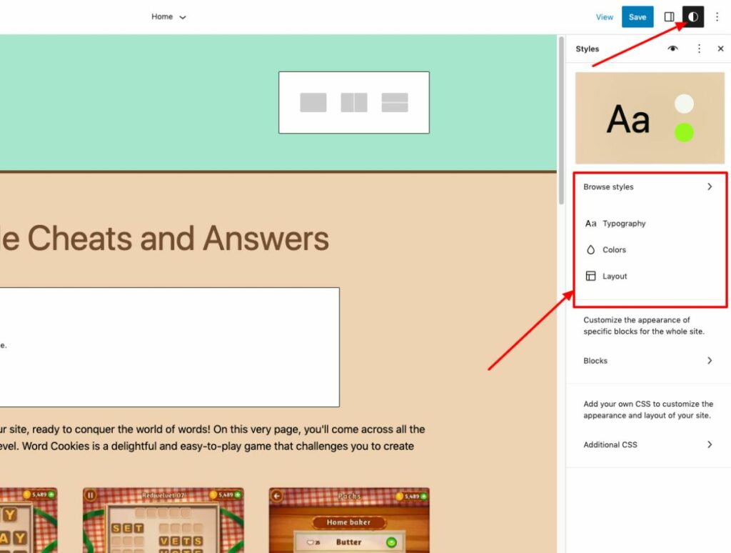
To access it, simply click on the Styles icon at the top of your page, located next to the Publish/Update button and the Settings icon, and choose the style book icon below.
This feature streamlines the process of customizing your theme by making it easy to change the look of individual blocks, such as headings or paragraphs, without having to navigate through multiple settings.
For instance, when I tried it out on a test site, I found that having all these options in one place made it effortless to maintain consistent styling across my website.
The Style Book is an excellent tool for both beginners and experienced WordPress users who want to make their site look polished and professional.
With its user-friendly interface and seamless integration with custom CSS, it's an invaluable tool for both new and experienced WordPress users. I can confidently say that the Style Book will help you create a visually appealing and consistent website that will impress your users and boost your search engine rankings.
3. Copy/Paste Block Styles
One of the standout features introduced in the WordPress 6.2 update is the ability to copy and paste block styles. This addition makes it easier than ever to maintain a consistent look and feel across your entire site without the need for custom CSS or repetitive manual styling.
Previously, if you made style changes to a specific block and wanted to apply the same changes to another block, you would have to manually edit each block individually. However, with the introduction of the “Copy Styles” and “Paste Styles” options in WordPress 6.2, this process has become more efficient and user-friendly.
After making changes to a block, simply click on the block options and select “Copy Styles.”
Then, navigate to the block where you want to apply the copied style and click on the block options again. This time, select “Paste Styles” and grant permission for your browser to access the clipboard content.
Within seconds, the style of the first block will be applied to the second block, ensuring a consistent appearance across your site.
What sets this feature apart from its competitors is the ease of use and the ability to maintain a cohesive design throughout your website without the need for additional plugins or custom code. This not only saves time but also helps prevent potential formatting issues that can arise when using custom CSS.
From a user's perspective, the copy and paste block styles feature in WordPress 6.2 is a game-changer. It simplifies the design process and allows users to focus on creating engaging content without worrying about the intricacies of styling individual blocks.
Additionally, it ensures that the overall look and feel of your site remain consistent, which ultimately enhances the user experience and keeps visitors coming back for more.
One of the most noteworthy features introduced in the WordPress 6.2 update is the improved navigation block for menus. This enhancement makes creating and managing menu items more efficient and user-friendly.
In previous versions, users had to add navigation menus in the full site editor, which could be time-consuming and cumbersome. Now, with the subpanel under the Navigation block, adding, editing, and removing menu items is a breeze.
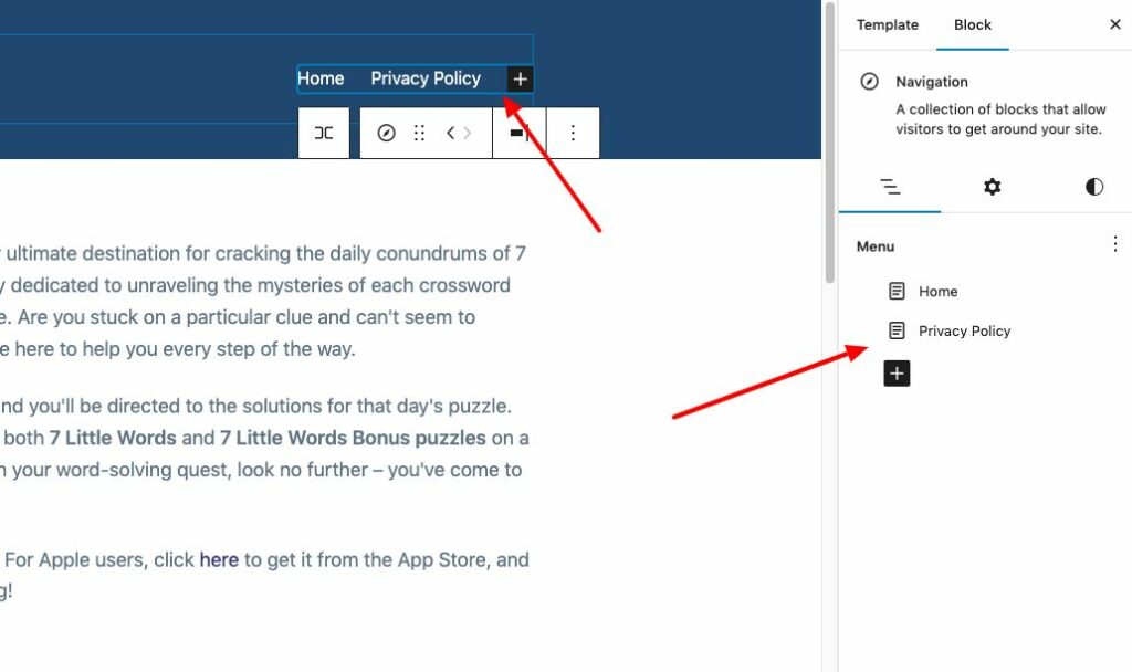
To utilize this feature, simply head over to Appearance → Editor and select the Header template for editing. Next, choose the Navigation block, and you'll notice a more streamlined interface for managing your menus.
You can easily add page links or custom links, set their properties, edit or rearrange items, and even create new blank menus or reload previous ones with just a few clicks.
This revamped interface makes managing menu items more intuitive, especially for beginners.
5. Add ‘Custom CSS' for theme or blocks
This feature allows users to further customize their websites without having to dive into the theme's code. It makes it much easier for both beginners and seasoned WordPress users to make visual changes with just a few clicks.
Previously, in earlier WordPress versions, users had limited options when it came to customizing the appearance of their themes. With WordPress 6.2, users can now add custom CSS to their entire theme or specific blocks through the Styles panel.
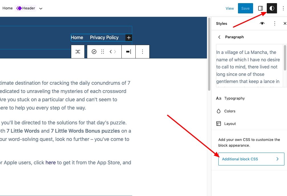
This feature is particularly useful for those who want to make minor adjustments to their theme without having to edit the theme's code.
Customizing your theme with custom CSS is now much more accessible and user-friendly. To access this feature, simply go to the Styles panel and select the block you wish to customize. From there, you can add your custom CSS and see the changes in real-time.
6. Openverse Free Media Library Integration
This addition brings a world of royalty-free images and media resources straight to your WordPress editor, making it easier than ever to find and use high-quality visuals for your website.
With the Openverse integration, you no longer need to search the web for free images or worry about licensing issues. Instead, you can access thousands of openly licensed and public domain works directly from your WordPress media library.
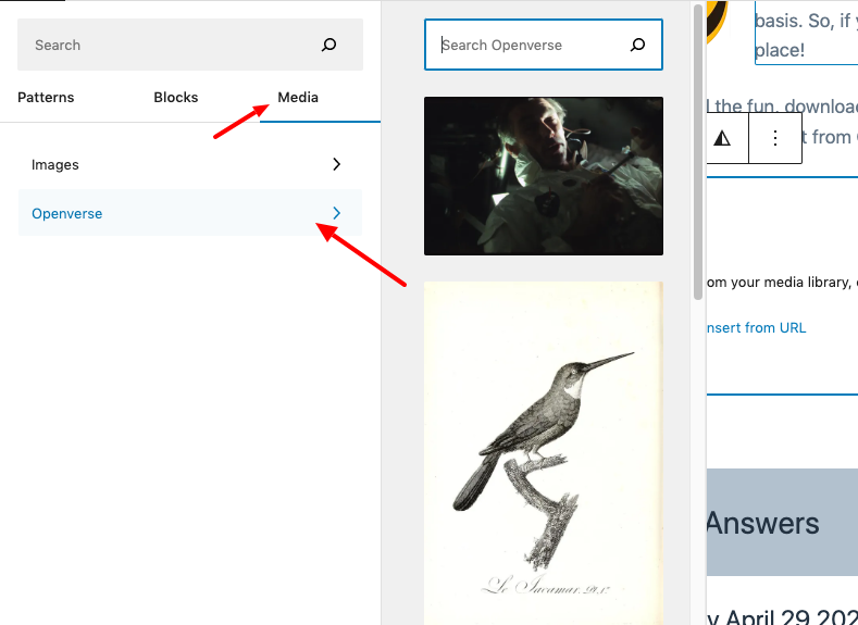
This feature can be found under the new ‘Media' tab in the inserter. Here, you can browse and choose from your own WordPress media library or explore the vast collection of royalty-free images available on Openverse.
The integration of Openverse into WordPress 6.2 saves time and effort for content creators, as it streamlines the process of finding and using high-quality images for your website.
When you select an image from Openverse, it is automatically inserted into the editor and downloaded to your WordPress media library. WordPress also saves the image caption, which may include a link back to the original source. However, you can remove this caption if the image is in the public domain.
This new feature not only enhances the visual appeal of your website but also supports the creative community by promoting the use of openly licensed and public domain works.
Openverse is a sister project of WordPress.org and is dedicated to fostering a culture of sharing and collaboration among artists, designers, and content creators.
7. Apply Block Changes Globally
Now you can apply block changes globally. This innovative feature not only streamlines the editing process but also allows users to maintain a consistent look and feel across their entire website.
When it comes to applying block changes globally, the process is easy and intuitive. You can access the Style Book by clicking on the Styles icon at the top of your page, which displays a comprehensive overview of how every block in your site's library looks.
By editing individual blocks within the Style Book, you can change the appearance of your entire theme and create a unique style of your own. These changes will apply globally to your theme, ensuring a consistent design throughout your website.
8. Document Details and List View
Document Details and List View are essential components of WordPress 6.2 that have undergone significant improvements, enhancing the overall user experience. Before this update, the Editor toolbar featured separate buttons for Details and List View.
The Details popover in WordPress 6.1 provided essential information such as the number of words, characters, reading time, headers, paragraphs, and blocks, as well as the Document Outline.
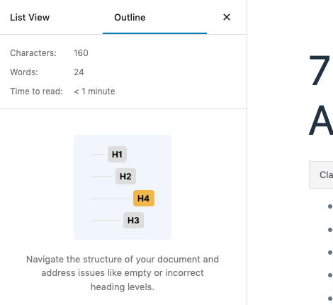
In WordPress 6.2, List View and Details have been combined into a single Document Overview panel divided into two tabs: List View and Outline. This integration significantly simplifies document management, allowing users to navigate and edit their content more efficiently.
As a content writer who has been using WordPress for years, I can attest to the convenience and ease of use brought by this update. The new Document Overview panel has made it easier to switch between List View and Outline, allowing me to focus on my writing without getting lost in the document structure.
This streamlined approach has helped me save time and effort when working on large articles with multiple headings and sections.
9. Sticky Positioning Support
Another key update is the introduction of Sticky Positioning Block Support. This feature enhances the functionality and user experience of the WordPress block editor, making it more versatile and user-friendly for content creators.
Sticky Positioning Block Support allows you to enable sticky positioning for Group blocks at the root of the document. This new feature is particularly useful for creating sticky headers and footers, improving the overall look and feel of your website.
The feature can be enabled through the Position panel of the Inspector control sidebar. Once activated, the HTML tag receives an ‘is-position-sticky' class and the following CSS rules are applied to the corresponding element:
.wp-container-1 {
    top: calc(0px + var(--wp-admin--admin-bar--position-offset, 0px));
    position: sticky;
    z-index: 10;
}
It's important to note that sticky positioning currently only works for Group blocks at the root of the document. However, further exploration is underway to develop a suitable solution for nested blocks, offering even more flexibility for users in the future.
Enabling sticky positioning can be done by theme developers using the appearanceTools feature in theme.json. For more granular control, you can set the settings.position.sticky prop to true. This level of customization allows theme developers to create unique and engaging designs, setting their themes apart from competitors.
10. Shadows
Shadows in Global Styles is an exciting addition to the WordPress 6.2 update, allowing users to add a touch of depth and visual appeal to their site designs.
The Shadows feature is part of the Global Styles update, which is now available for certain blocks, such as the Button block. This functionality allows users to add and customize shadows directly from the Global Styles interface or theme.json.
For example, while using the Twenty Twenty-Three theme, you can access the Shadow feature by navigating to Styles > Blocks > Button and clicking on the Shadow button. This will present you with a Shadow pop-up that offers a selection of shadow presets from the theme.
For theme developers and advanced users, you can also add a shadow to blocks using theme.json. This code snippet shows how to add a 3px black shadow to Button blocks:
"styles": {
    "blocks": {
        "core/button": {
            "shadow": "3px 3px #000000"
        }
    }
}
Moreover, you can define presets for users to choose from in the Styles interface. This not only makes it easy for users to apply consistent shadow styles across their site but also encourages them to experiment with different shadow effects.
11. Distraction Free Mode
When working on your WordPress site, focusing on your content is critical for creating engaging and informative posts. With the release of WordPress 6.2, the “Distraction Free Mode” has been introduced to help users maintain their focus while crafting content.
This feature is designed to remove any unnecessary clutter from the editing interface, allowing you to concentrate on what truly matters – your content.
As of WordPress 6.2, you can now activate Distraction Free Mode by clicking on the three dots at the top right corner of your page (next to Publish/Update and settings) and selecting “Distraction Free.”
This action hides all the toolbars that you typically see when working on your page, providing a more serene environment for content creation. For an even more immersive experience, consider activating Fullscreen Mode as well, which hides your admin UI and further streamlines your workspace.
Distraction Free Mode has been praised by users for its ability to create a more focused working environment. This mode not only helps users concentrate better but also minimizes the chances of errors caused by distractions.
As a content writer, I can attest to the significant impact that Distraction Free Mode has had on my productivity. Since adopting this feature, I have noticed a marked increase in my ability to focus on crafting high-quality content. My writing sessions have become more efficient, and my content quality has improved as a result.
12. Performance Improvements
The WordPress 6.2 update brings a myriad of performance improvements to the platform, ensuring faster load times and smoother user experience. Users can expect around 20% faster TTFB (time to first byte) and about 14% faster LCP (how long it takes for the largest piece of content to appear on the screen) for block themes, according to the WordPress 6.2 field guide. In pages with hero images, the LCP improvements are even more substantial at around 19%.
These noteworthy enhancements are made possible by the appointment of a dedicated performance lead, Felix Arntz, for the first time in a WordPress release. This change signifies the platform's commitment to continually prioritize performance in future updates, ensuring your website remains fast and responsive.
Conclusion
In conclusion, the WordPress 6.2 update brings a wealth of performance improvements, streamlined features, and user experience enhancements to the platform.
These changes not only make website management easier but also ensure your site remains fast, responsive, and visually appealing. Don't hesitate to upgrade and take advantage of these new features, as they will undoubtedly elevate your WordPress experience.
Ludjon, who co-founded Codeless, possesses a deep passion for technology and the web. With over a decade of experience in constructing websites and developing widely-used WordPress themes, Ludjon has established himself as an accomplished expert in the field.




Comments