In this article, I will guide you on how to make accessible websites, so let's start.
Imagine that you're the owner of a grocery store. You want your store to be welcoming and easy to use for customers of all kinds. If a customer came into your store in a wheelchair, you'd want them to be able to maneuver through the aisles and find the products they need, having just as positive an experience as a customer who isn't in a wheelchair.
This might seem obvious for a store owner to think about, but it's something website owners need to consider as well. Your website can be reached by users of all types, including those with disabilities or limitations. How are you going to make sure that they can access your content easily? The answer to this question is accessibility.
What is Web Accessibility?
Web accessibility is the practice of making websites usable for all visitors, including those with disabilities, impairments, and limitations.
Web accessibility involves following certain guidelines and design principles to ensure that people who experience difficulties or limitations have the same or a similar experience as those who don't. The goal is to give everyone equal access to all your content. This, in turn, will enhance the user experience for every one of your visitors.
You may be wondering, is my website required to be accessible? Well, this depends on the country you operate in and the type of business you run. Check your local guidelines to find out.
However, even if your business is not legally required to have an accessible website, it doesn't automatically mean that you'll avoid a lawsuit. There have been many cases in which major companies have been sued for the lack of an accessible website.
To avoid legal trouble, make sure your website doesn't prevent anyone from consuming, navigating, or obtaining any of the information you share. The best way to do this is by abiding by the Web Content Accessibility Guidelines (WCAG).

Keep in mind that accessibility is also important for Google rankings and it is one of the tests of the Lighthouse performance.
WCAG guidelines and standards
The web content accessibility guidelines are published by the Web Accessibility Initiative (WIP) of The World Wide Web Consortium (W3C). These guidelines are highly detailed and include many suggestions for how to ensure your website is accessible to all users. The guide is primarily targeted toward web content developers, such as content writers and website designers, so it's a great tool to have on hand if you are one of those people or manage those people.
Four main principles of focus for an accessible website
- Perceivable
- Operable
- Understandable
- Robust
Perceivable as a principle of accessibility
Visitors must be able to perceive the content and information that's presented on your website.
Now, “perceive” doesn't necessarily mean “see with your eyes.” Users who are blind or have low vision often browse the web using screen reader software, which converts text into braille or synthesized speech.
A few key ways to make your website perceivable:
First, provide text alternatives to any non-text content. That includes images, videos, and audio content, which all should have a text alternative so that individuals utilizing screen readers can understand them. Include alt text for all images on your website.
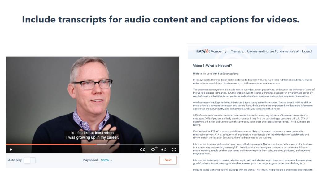
Second, offer alternatives for time-based media, which means audio and video content. Include transcripts for audio content and captions for videos.
Finally, make it easy for users to see and hear content. High color contrast enables everyone to read the content and understand the visual information on your site. You can use the color contrast checker linked in the resources section to make sure the colors you're using are properly contrasting.
Operability as a principle of accessibility
An operable website can be used without disrupting the user in any way. This means all visitors can use every part of the site's functionality, including navigating to a page, selecting a link from a menu, and playing or pausing a video.
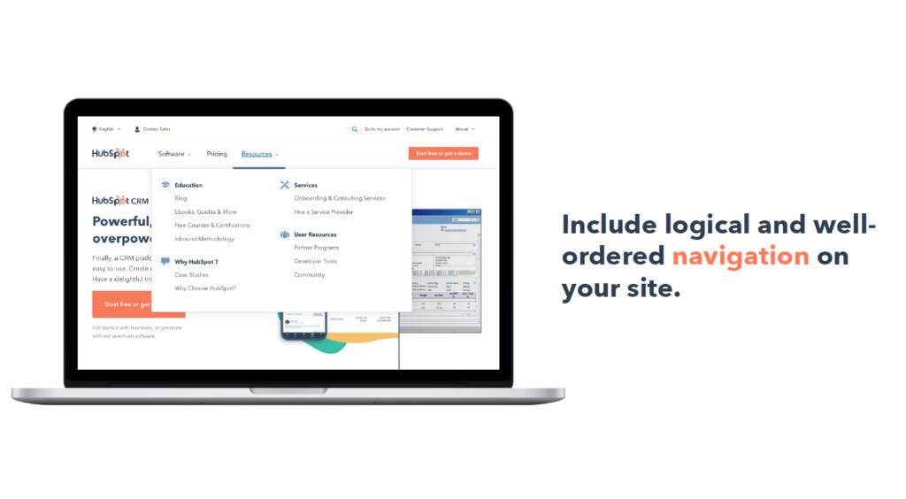
Make all functionality available from a keyboard. For example, the tab key should let users jump between elements on the page, and the return key should click the element in focus. Include logical and well-ordered navigation on your site. A clear page title, meaningful links, and proper headings will help users easily navigate, find content, and determine where they are on your site.
Avoid blinking or flashing content. This can be a seizure trigger and you definitely want to avoid that on your website. Or, if it's necessary, provide a warning beforehand.
Provide enough time to engage with your website. If any action includes a time limit, users should be able to extend or cancel it. For example, if a user hovers off your dropdown menu, there should be a slight delay before the menu disappears.
Understandability as a principle of accessibility
An understandable website has a few key components: First, text content should be straightforward and readable. Your writing should be easily understood by as many readers as possible.
Second, pages should be structured logically. Have consistent navigation and naming conventions across all pages on your site. Navigation menus are typically found in the header and footer of each page.
Third, help your users avoid and correct mistakes. Include helpful error messaging when someone makes a mistake, such as missing a required question on a web form.
Robust as a principal of accessibility.
Finally, your website should be robust. Content should be easily interpreted and consumable by all visitors, including those who use assistive technology like screen readers. This principle mostly has to do with the coding of your website and writing your HTML in a way that assistive technologies can parse and understand. Consider using the Website Accessibility Evaluation tool.
Example websites
The website for The National Federation of the Blind focuses on supporting those who are blind or visually impaired, which is why having an accessible website would be important to them.
First, notice the highly descriptive alt text for the header image. This means that visitors using screen reader technology will know exactly what that image is portraying.

The entire website can be navigated using a keyboard.
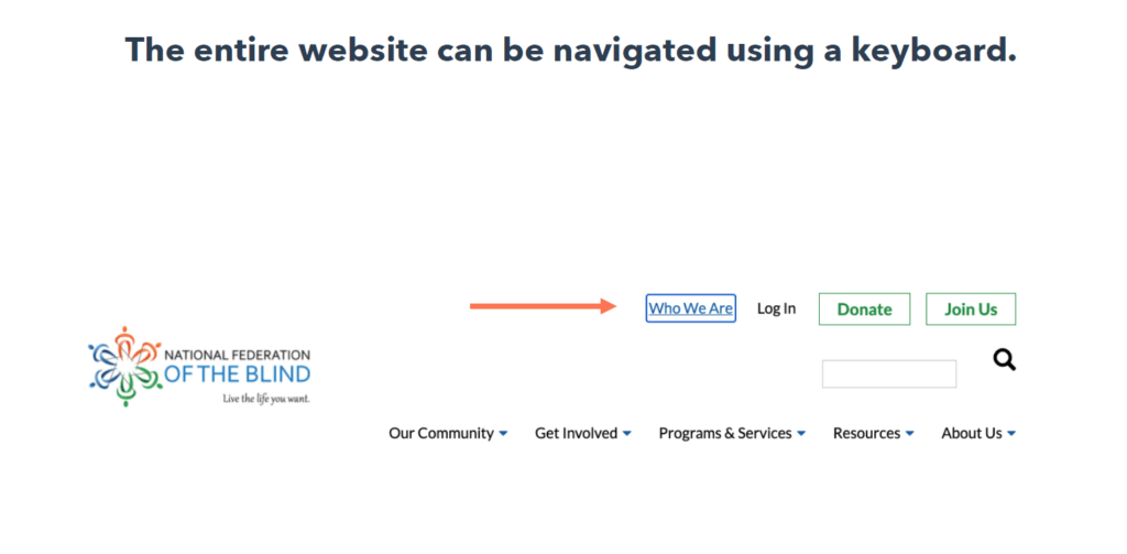
Their navigation is also logically laid out and easy to follow. The text is high contrast and large scale, which makes it easy to read. Visitors can also increase the text size up to 200% without reducing readability.
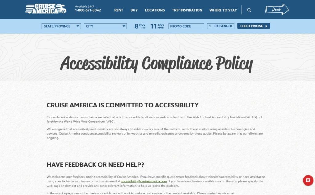
Cruise America, a leading provider of RV rental in San Francisco is also a great example of creating a beautiful website without compromising the accessibility. Their website is fully compliant to the WCAG and they proudly tell their users about this and how they can easily navigate their website.
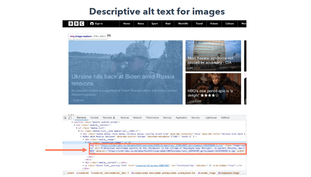
The BBC is a news organization with a vast website that contains a great deal of content, but they are committed to having their website be accessible to all.

The site includes descriptive alt text for all images to make it accessible for those browsing with screen readers.
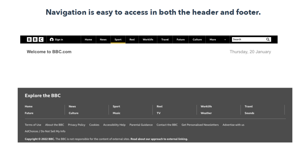
Visitors can navigate the entire site using a keyboard. The navigation is laid out logically and is easy to access in both the header and footer of the site.
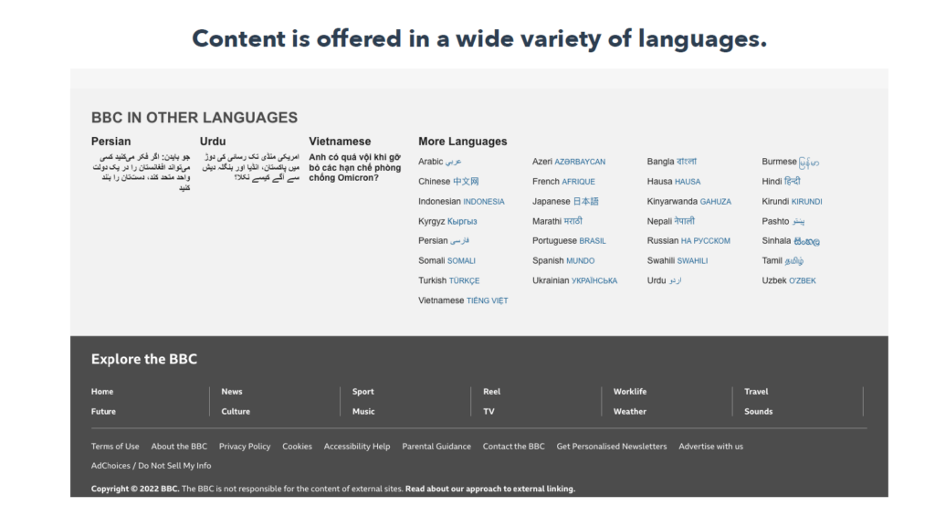
Additionally, to make its website accessible to visitors from around the world, the BBC offers its content in a wide variety of languages which are easily accessed from the homepage.
Remember, a big part of inbound marketing is focusing on the customer and their needs. Your website should be no different. Although it may not be legally required, it's a smart idea to make your website as accessible as possible. This will create a positive user experience for website visitors of all kinds, which will help improve your SEO, raise your conversion rate, and boost your customer loyalty.
Fundamentals of Information Architecture
Think about the last book you read. It probably started with a title page, followed by a table of contents with the book's chapters and their page numbers. You can flip to a specific chapter easily because you know exactly where it is and what you're going to find there.
This type of structure applies to your website, as well. That structure is called information architecture.
What is information architecture?
According to the Institute of Information Architecture, information architecture (IA) is the practice of deciding how to arrange the parts of something to be understandable.
So, what is the relationship between information architecture and user experience (UX) design? Information architecture is a key piece of the user experience of your website. You can't have a good UX without a good IA.

Building the information architecture of your website should be one of the first steps in your UX design process. To build an IA, you need to take into account two major factors:
- The user's context
- The user’s needs
Context is the environment in which the user will engage with the content. Think about where, when, why, and how someone will be seeking out and engaging with your content. For example, will they be accessing your site on mobile devices? Will they be seeking out information about a service they'd like to hire you to perform?

Structure content to address your visitors' needs, goals, behaviors, and expectations. To identify these, you need to find out who your user is, what value your content provides them, and how they actually use your content. This all falls into the bucket of “user research and testing.”

Eight principles of information architecture
According to Dan Brown (2010), these are the eight IA principles:
- Objects
- Choices
- Disclosure
- Exemplars
- Front doors
- Multiple classifications
- Focused navigation
- Growth
The Principle of Objects
The Principle of Objects states that pieces of content are unique and dynamic.
Each piece of content has its own attributes, behaviors, and life cycles, which must be taken into account to make the best use of that content. For example, if you have product pages for items you no longer sell, these can be archived or recategorized.
Before you start structuring and organizing content, identify the kinds of content you're going to create. For example, will you be primarily creating blog posts and product pages? Are you going to have videos embedded in this content?
Once you identify the content types you'll be creating and how they relate to one another, then you can start mapping out how to best provide this information to your website visitors.
If you already have an existing website, start with a content audit. Taking inventory of all the content currently on your website will help you figure out how to best structure it.
The Principle of Objects
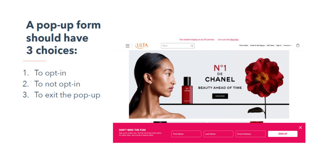
The Principle of Objects states that you should limit the amount of choices presented to a user to only the most meaningful and relevant.
For example, if you have a pop-up form that asks visitors to opt into your email newsletter, then there should only be three choices for the user: to opt-in, to not opt-in, and to exit out of the popup. This will limit the amount of cognitive effort required of the user, which improves their experience.
The Principle of Disclosure
The Principle of Disclosure states that you should only disclose what's necessary for the user to understand what they'll find next and make a decision.
Take the example of an email newsletter opt-in form that we just looked at. It includes a headline and short description to convince visitors to opt-in, then the actual form itself. If visitors do opt-in, they may be redirected to a landing page or sent a welcome email, but only after they've taken that action.
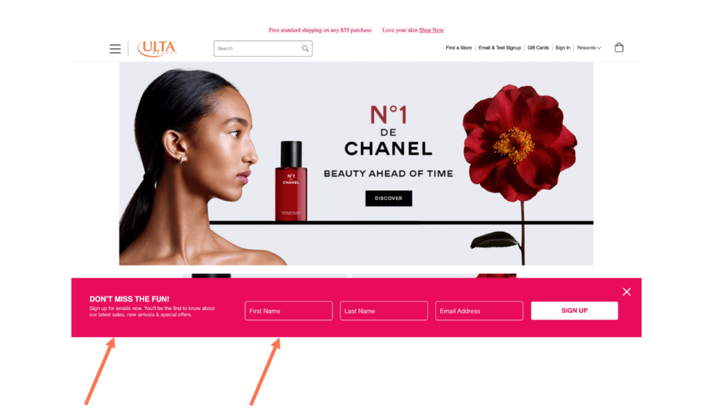
The goal is to not overwhelm the user with too much information. You only want to provide them with a certain amount of content at a time so it's easy to digest.
The Exemplars Principle
The Exemplars Principle states that you should describe the contents of categories by showing examples.
E-commerce sites are the best example of this principle in action. Look at the Arhaus homepage.
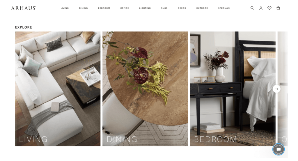
It shows images for the categories “Living,” “Dining,” and “Bedroom.” While these category names are clear, including a visual example helps visitors understand the types of products they can expect to find when they click on one of these options — for instance, bed frames, nightstands, and dressers in the “Bedroom” category.
The Principle of Front Doors
The Principle of Front Doors states that your website has multiple access points.
In a perfect world, every visitor to your website will land on your homepage first, but in reality, that isn't going to happen. So, you have to structure your website to account for people entering it via different pages.
By placing navigation menus on all your website pages, you'll ensure that visitors know where they are on your site and what next steps they can take, regardless of where they land. You can also include important information on multiple pages, such as a short description of your company in the footer that appears on every page on the site.
The Principle of Multiple Classification
The Principle of Multiple Classification states that you should provide users with multiple ways to browse content on your site.
This is important because different people prefer to consume content in different ways. For instance, some users may prefer using your navigation menu to locate a piece of information, whereas others might want to search for that information using a search bar. This principle is separate from providing accessible ways for users to browse content.
The Principle of Focused Navigation
The Principle of Focused Navigation states that navigation should be consistent across your site and only contain relevant content.
This helps people easily navigate your site to find the content they need. For example, if the navigation menu on your homepage has an item for “Products” with sub-navigation which lists all of your available products, this same menu should appear on all pages on your site to maintain consistency and avoid confusing people.
The Principle of Growth
The Principle of Growth states that you should construct your information architecture so that it can accommodate your website as it scales.
Leave room to add new content within existing sections of your website, and add entirely new sections.
For example, let's say you run a real estate website. Under the category for “Listings for Sale,” you have two subcategories for New York and New Jersey since these are the areas you currently sell property in.
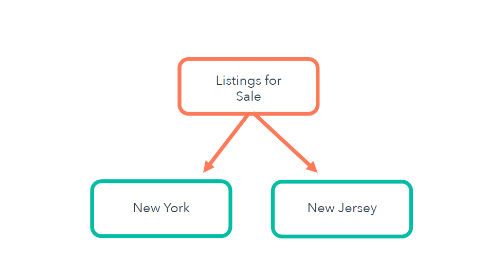
However, over time you might expand your business and want to add two more subcategories for Connecticut and Pennsylvania.

Or, you could expand your business to rental properties and then want to create a completely different category for “Listing to Rent.” These principles will help to guide your design process and provide you with best practices to follow.
Example of information architecture
Keep in mind that a website's content will largely dictate how it is structured. An e-commerce website will look very different from a healthcare website, which will look different from a marketing agency's website, and so on. There is no single “correct” IA — it's all dependent on the individual website.
Let's examine the website for the Edmonton International Airport. Since they are a large international airport with thousands of people coming through its doors every day, the goal of its website is to get flyers the information they need as quickly and easily as possible.
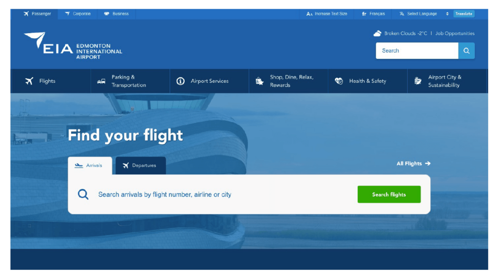
First, let's break down the navigation menu. The top-level of navigation includes 6 main categories: Flights, Parking & Transportation, Airport Services, Shop Dine & Relax, Health & Safety, and Airport City & Sustainability.
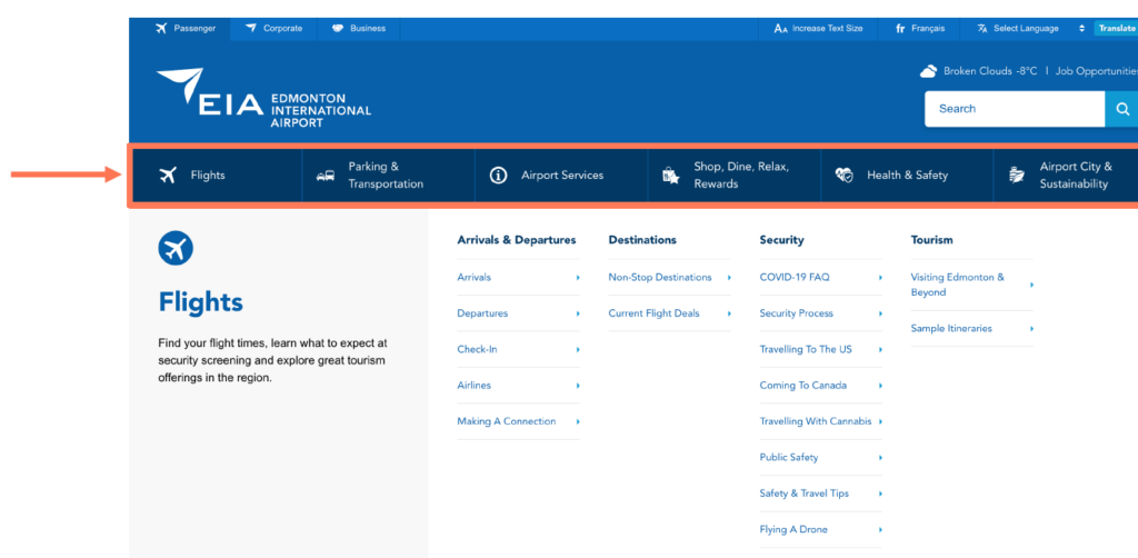
Under the main navigation menu, Edmonton lays out structured, detailed sub-navigation. The second tier of the nav includes four subcategories: Arrivals & Departures, Destinations, Security, and Tourism.
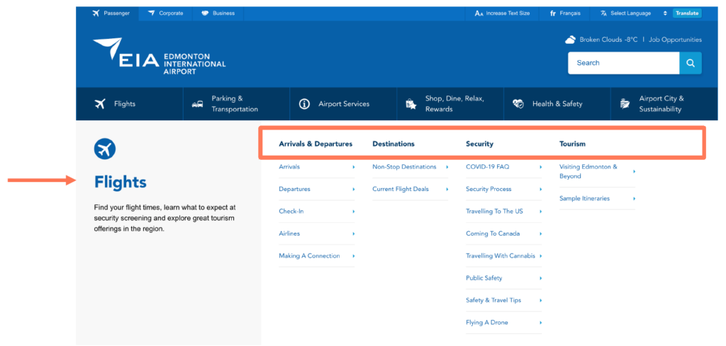
Regardless of which page you enter the EIA website on, the navigation remains the same.
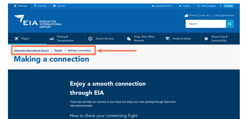
Additionally, there is a breadcrumb menu to help you identify where exactly you landed on the site. A sample of their website's structure is below.
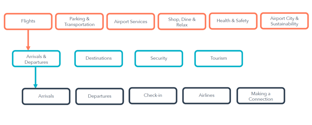
As you can see, even in the case of a website with a great deal of information to organize and convey, a good IA makes it so that any user can understand where they are and where to go to find the content they need.
Information architecture is a critical piece of the user experience. You could have the most beautiful website design in the world, but without a solid structure, the user experience will suffer. You want your website visitors to not only be able to understand the structure of your content, but to predict it. This is the sign of a truly good IA: users can find the information they're looking for quickly, easily, and intuitively.
Rachel is an Inbound Professor on the HubSpot Academy team focused on educating and inspiring people about HubSpot CMS Hub. When she’s not teaching website design or SEO, you can find her reading historical fiction, singing show tunes, or taking care of her many plants. Connect with Rachel on Twitter or LinkedIn.



Comments